מדריך בלוקי שדות
שדות בחירה בכפתור
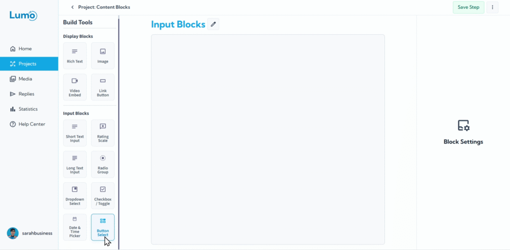
When you need users to choose from a clear, predefined set of options, the Button Select field offers a highly visual and intuitive way to capture their choice. This Field Block presents each option as a distinct button, allowing users to simply click their selection. It's excellent for forms where clarity and ease of interaction are key.
This guide will explain how to set up Button Select fields in your Lumo.
What is a Button Select Field?
A Button Select field displays a list of options as individual, clickable buttons. Users interact by simply clicking the button that corresponds to their choice. It's often used for a small to medium number of options where visual distinction is beneficial.
Step-by-Step: Adding a Button Select Field
Configure the Field's Core Settings: After adding the block, you'll set its essential properties:
Field Label: This is the question or instruction presented to the user.
Selection Type: Decide how many options users can pick:
- Single Choice: Users can select only one option from the displayed buttons.
- Multiple Choice: Users can select one or more options from the displayed buttons.
Edit Content of Each Option: This is where you define the specific choices that will appear as buttons.
- Click "Add Option" to create a new button.
- Enter the text for each button.
- You can add as many options as you need.
Saving Your Changes
After configuring your Button Select field, remember to manually save your changes by clicking the "Save" button in the editor.
If you try to navigate away from the editor without saving, LumoPages will remind you to save your work. Always pay attention to these prompts to avoid losing your progress, especially if your Lumo is live!
Button Select fields are a great way to make choices clear and engaging for your users, especially when you have a limited number of distinct options. They provide a satisfying click-based interaction that enhances the user experience.